Specifications & Colours of Screenflex
Screenflex products are built to exact standards based on our architectural background & decades of building the world's highest quality portable room dividers. Our easy-to-use accordion-style room dividers come in various sizes and are fully portable, making them simple to move wherever you need them.
Because our customers often move our products to use them in many locations, we suggest you pick a colour that will work well in different environments. Our colourful fabric room dividers offer up to 50% sound absorption and withstand years of items tacked to the surface. In addition to our many colours, you can also cover some or all panels with a whiteboard surface, fire-resistant material, have your logo printed on any of our vinyl partition walls, or even include a mural across the entire divider.
Specifications by product
Standard Fabric
Designer fabric colours.
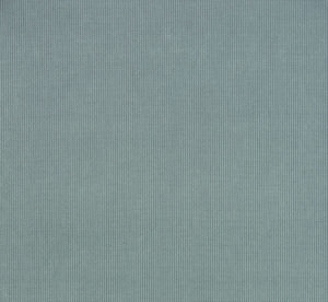
Stone
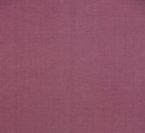
Rose
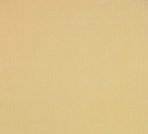
Desert
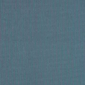
Lake

White

Charcoal Black
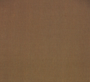
Walnut
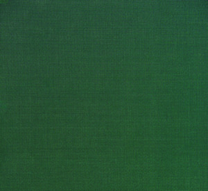
Mallard

Primary Red

Primary Yellow

Primary Blue
Standard Fabric
Excel fabric colours
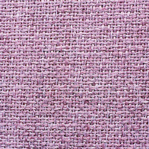
Cranberry
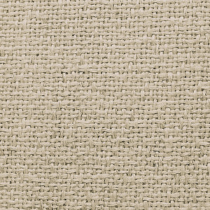
Beech
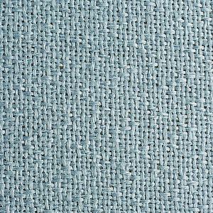
Grey Smoke
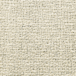
Sand
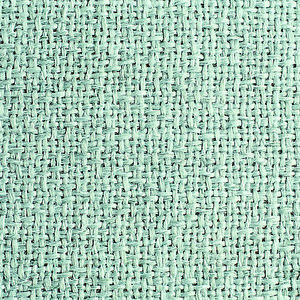
Sea Green
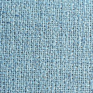
Summer Blue
Colour schemes to consider when choosing your room divider hue
Choosing the right colour for your fabric room dividers
When choosing room divider colours, consider the room divider’s intended purpose before making your final colour choice. You might feel like there are so many colour choices you are sure to find at least one you like. Will your fabric room dividers, need to blend into the environment, or would you like them to stand out? Are they meant to be an eye-catching display board or a distinctive traffic control divider? Take a look around you and figure out a good fit for your room. Fortunately, the colour is the last component you need to worry about.
Similar Colour Schemes
If your room contains cool colours (pinks, purples, blues, and certain greens), it’s best to stay with other cool colours. A couple of cool neutral colours are blue and grey. These colours tend to coordinate with most other cool colours. If your room contains warm colours (reds, oranges, yellows, and some greens), selecting a warm-toned room divider would be best. Beige or tan room divider colours tend to be easy to coordinate with warm neutral colours.
Opposing Colour Schemes
Complementary colour schemes are colours that are opposite each other on the colour wheel. Red and Green, Purple and Yellow, Pink and Green, Blue and Orange are all complementary colours. If you are looking for a high contrasting look, you might want to try selecting a colour that is the opposite of the colours in your room. Be cautious! Using complementary colours can be tricky. These colours together are vibrant and eye-catching, use the complementary colour scheme only if you want your room divider to stand out.
Analogous Colour Schemes
Using these colours create a sense of comfort and serenity. Analogous colours use colours that are next to each other on the colour wheel. They are colours that are often found in nature and are pleasing to the eye. When using similar colours be sure to use only one hue as the primary colour. Some examples of analogous colours are red and orange, green and yellow-green, blue and purple, purple and magenta.


